>> Return to graphic design services...
Steps for creating great graphic designed documents
Graphic Design Cornwall Knowledge Base
Article level - introduction
Time to read - 10 mins
To ensure that your graphic design will be successful there are some crucial steps that I follow whenever I come to design an item of marketing collateral. When I am wearing my graphic designer hat I’ll always dig these steps out of my toolbox.
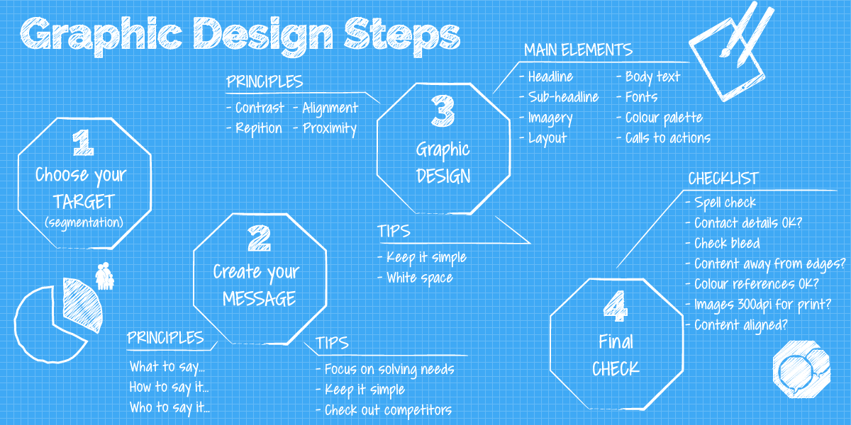
Step 1 - Choose who you’re going to target
Have you read our article on segmentation yet in our marketing section? I recommend reading that first and then returning to this graphic design knowledge base article.
Overall, you need to have a clear idea of who you are targeting (i.e. what defines them, age, gender, behaviour, job position etc.), what their needs or pains are and how your product or solution will solve this need or pain.
It’s easier to design a piece of marketing collateral when you have a clear image of the person or business you’re targeting in your head. The more you define the segment the easier this image should become. And remember, the reason you’re doing this is that your targeted segment will react much more positively to any marketing messages that are more closely tailored to them and their needs.
This element is going to be your main focus that you’re constantly testing against when you’re a) graphic designing or b) working with a graphic designer. I recommend installing the segmentation plugin in your brain and to keep it running.
Step 2 - Create your message
This isn’t strictly graphic design but it has such a large impact on the final designed piece that it needs to be a key step in the graphic design process.
What you want to say…
This is what you want to say to your targeted segment, not how you’re going to say it.
To get to the nitty gritty on writing your message, imagine saying exactly what you want to say without it being edited for perfect English, politeness or marketing speak.
Focus on solving one overriding need or pain that the customer has. In my experience, one overriding message works far better that multiple messages.
How you’re going to say it…
OK, now it’s time to really think how you going to say what you want to say; saying it in a way that will be the most appealing to your targeted segment through the use of headlines, text, fonts, colours and all the other graphic design elements that we’ll go through shortly.
At this point, I normally go into headline writing mode with a blank sheet of paper and a pencil. Also, at this time, I am searching through images to see what could work to complement what I have noted down.
Write down everything that comes to mind - good or bad. Sketch pictures of your imagined image or cut and paste image ideas from the Internet.
Who’s going to say it…
At this point you might also want to introduce a character who will deliver your message within the graphic designed piece. It can be anyone, from well known individuals to someone who would appeal to your target audience.
Overall, during this step, I’m searching for that creative hook that will resonate with my targeted segment. My objective for the end of this step is to have a rough combination of headline and image (plus character maybe) that will catch your targets eye, create interest, be memorable and get them to take the action that’s required for the marketing piece.
Be warned this can take the longest time of all this process and it can be demoralising when all you have to show for your work is a pencilled out idea!
Once you have a rough headline and some ideas on images. Then you can start to write any sub headlines that might be needed to better support your main headline and also to start draft writing the body copy, i.e. the main text. With the latter, make sure you have a rough idea of what size document you’re writing for… there’s no point writing more than can reasonably fit on the finally selected document.
WARNING - Check out the competition…
As you start to narrow down your ideas on your message checkout what the competition are doing or have done. You don’t want to inadvertently copy something that they have produced.
Step 3 - Start graphic designing
When it comes to the actual designing I always stick to the following rules. What are these?
Always consider your target audience and what you’re trying to communicate to them when any element gets placed on the page C.R.A.P - Graphic designers like the acronym C.R.A.P to help them remember four golden design rules - contrast, repetition, alignment and proximity… I’ll go over these quickly. Less is more and leave enough white space (i.e. gaps) around your graphic design elements - definitely avoid clutter
Here are the C.R.A.P principles…
Contrast - basically avoid elements on the page that look too similar! Use fonts, colours, size, shapes (and more…) to create difference (i.e. contrast) in order to draw attention to key elements of your graphic designed piece.
Repetition - reuse elements of your design to give it continuity; to make it feel like it all belongs to the same family. It maybe reusing a colour for key headlines, or a shape to indicate a tip.
Alignment - keep things lined up so that it’s tidy. Make sure that elements in your graphic designed piece connect with other items on the page.
Proximity - make sure you group related items together, within proximity of each other.
If you’d like more information on C.R.A.P then I suggest Googling ‘graphic design principles C.R.A.P’
Refine your headline and sub-headline
Refine your headline and continually check whether it is genuinely addressing a need or pain of your targeted segment. Keep it as short as you can so that it isn’t restricted in size by the page’s dimensions.
Be brave and make sure the headline stands out as much as it can. Use the principle of contrast to do this… using font, size, shapes and more to bring the attention that it deserves. Consumers have split seconds to notice a headline so make sure yours does the best it can at being noticed.
Source your main image
You should have some rough ideas from step 2 of the image that you want to use with your headline. Now is the time to find that main image.
In my opinion, and depending on the product, the best imagery is your own… as long as it is high quality. If you don’t have high quality images then you need to employ a photographer or search for royalty-free images online. My favourite sources are - ShutterStock, Adobe Stock and Alamy. If you’re looking for people type shots then I would recommend avoiding the ‘staged model’ look; there has been a recent push for more natural looking photography and so you might just find what you’re after.
Remember to choose an image that a) appeals and resonates with the needs / pain of your targeted segment b) complements your headline c) suits your graphic design piece, i.e. landscape or portrait d) with space for text to be overlaid on it (if necessary).
Other considerations could be - Selecting a striking image that draws lots of attention Complementing your business’s colours
Collate other imagery including icons
With my graphic design hat on I also like to use icons to help draw attention or explain key information. There’s an enormous supply of vector drawn artwork out there to avoid having to draw icons yourself. However, only use them if they are supporting your message and not just for the sake of it.
Favourite sources for me are - Freepik and Shutterstock. When choosing icons if you have more than one then ensure that they look like they are from the same family, e.g. line thickness, style etc.
Icons are perfect for the ‘repetition’ principle of the graphic design golden rules and when combined with a repeating colour are perfect for supporting the unity of the piece.
Create your layout
Before you can start designing your layout you need to choose what kind of document the piece is going to be. It will need to be the best at reaching your targeted segment. Balance this decision with your available marketing budget.
If it is print and an A5 leaflet through the door is going to be a good option then you can start to design your layout based on this size.
At this point in the design process, I grab pencil and paper and start to sketch my layout. I use a web design principle called ‘Wireframing’ to help my layout take shape. For this purpose, wireframing is simply drawing empty content boxes on the page and labelling them with what will go inside. You could also scribble on your headlines.
Don’t forget you can use all manner of shapes in your layout design to help communicate your message.
And if you run out of layout ideas there are plenty of templates online that you can look through for inspiration.
Refine your body text
With your document size selected and your wire frames completed… you now know exactly how much space you have for your main body text. Start to refine your text so that it addresses the needs / pain of your targeted segment with as little text as possible. We English like to waffle and say what we really want to say after the waffle… now is not the time to do that! Get to the point and quickly.
Select your fonts
Choose fonts that are going to appeal to your targeted segment and that will also provide you with contrast between your headlines, calls to actions and main body text. Sometimes it’s wise to buy a family of fonts so that you have a choice of different weights available to you. Aim to stick to your corporate font for the main body but experiment with heading fonts if OK with your boss!
Also, you may consider choosing fonts that are also available for using on your website. For example, I selected Raleway for Fort Marketing’s website. It comes with a wide range of weights and can be used in print and for our website - it’s perfect for creating contrast between different headings.
Select your colour palette
At this point this is normally straight-forward as you have the palette that is associated with the business. With my experience of small businesses, certainly in B2B markets, they often have a limited palette, usually of similar colours and therefore their graphic designed pieces can lack energy.
Consider learning about the colour wheel and what colours work with each other. If you search Google using the keyword phrase ‘Colour Wheel’… you’ll find plenty of images of a colour wheel. Colours that go together well are as follows -
- Colours either side of a colour, i.e. a different tone
- Opposite colours - colours that are opposite each other on the wheel
- Triad colours - draw an equilateral triangle on the colour wheel, the colours at the points of the triangle work well
There are also lots of resources out there to inspire you including nature, colour books and websites. With the latter search through the palettes of ColourLovers.com.
Always ensure that if you’re matching colours that you have the correct CMYK references for each colour used throughout.
Calls to action
When graphic designing a piece you need to have in mind what you want the targeted reader to do. The call to action is the statement that provides instruction on what to do, e.g. call this number, visit this web landing page etc.
Make sure calls to action are prominent and clear so that the reader knows what to do next.
You might also want to consider adding an element that can support measuring how successful your graphic designed piece has been, for example, adding a voucher number to receive a discount or to add a weblink that lands on a campaign landing page.
Step 4 - Proofread, check and proceed
The final step is to run a final check on all elements of the graphic designed piece from spelling in the content through to the technical elements such as alignment of items. Here’s a checklist that might help you…
- Check contact details
- Spell and grammar check complete document
- Spell check company and brand names throughout
- Check document bleed
- Check that there are no items too close to the edge of the page that might get trimmed
- Check alignment of design elements
- All colours match business’s brand - check references
- All images for print are >= 300dpi
- Do you have the rights to use the images?
I hope you enjoyed this insight into elements that all marketers should know before they work with or graphic design themselves. We undertake graphic design projects and would love to hear from you if you’d like to progress a project. We’re based in Cornwall but are happy to work with you wherever you may be located.
By: Tim Bowerbank
Role: Design and Marketing